"Three different people have written to ask me to clarify my video on mixing greens for plein air landscape painting lately. Apparently I mumble. So here it is again, written down, my mixes and recommendation for greens.
First off, I should mention that there are many people whose opinions I highly respect that think my greens are terrible. Acidic, garish, too bright, too yellow, etc… That said, I try to honestly paint what I see and I like my greens. I was always partial to the story of John Constable who, when painting at a time when artists would cover their finished paintings with brown violin varnish to make them look Old Mastery, took a violin and laid it on the bright green grass to show the difference between the accepted pictorial norms of his contemporary artists and the colors of real life.
Secondly, I only mix my greens, so I don’t use viridian. I’ve tried putting it down on my palette but I end up never using it. However, it was on Gammell’s recommended landscape painting palette and you can see it in the work of many of the best painters so, if you like it, you’re in excellent company.
There are two blues and two yellows on the palette I was taught to use: Cerulean blue is a greenish blue, ultramarine is a purplish blue, cadmium yellow light is a pure, bright yellow, and Roman (or golden ocher) is a dirty yellow.
With these four colors you can get four different greens:
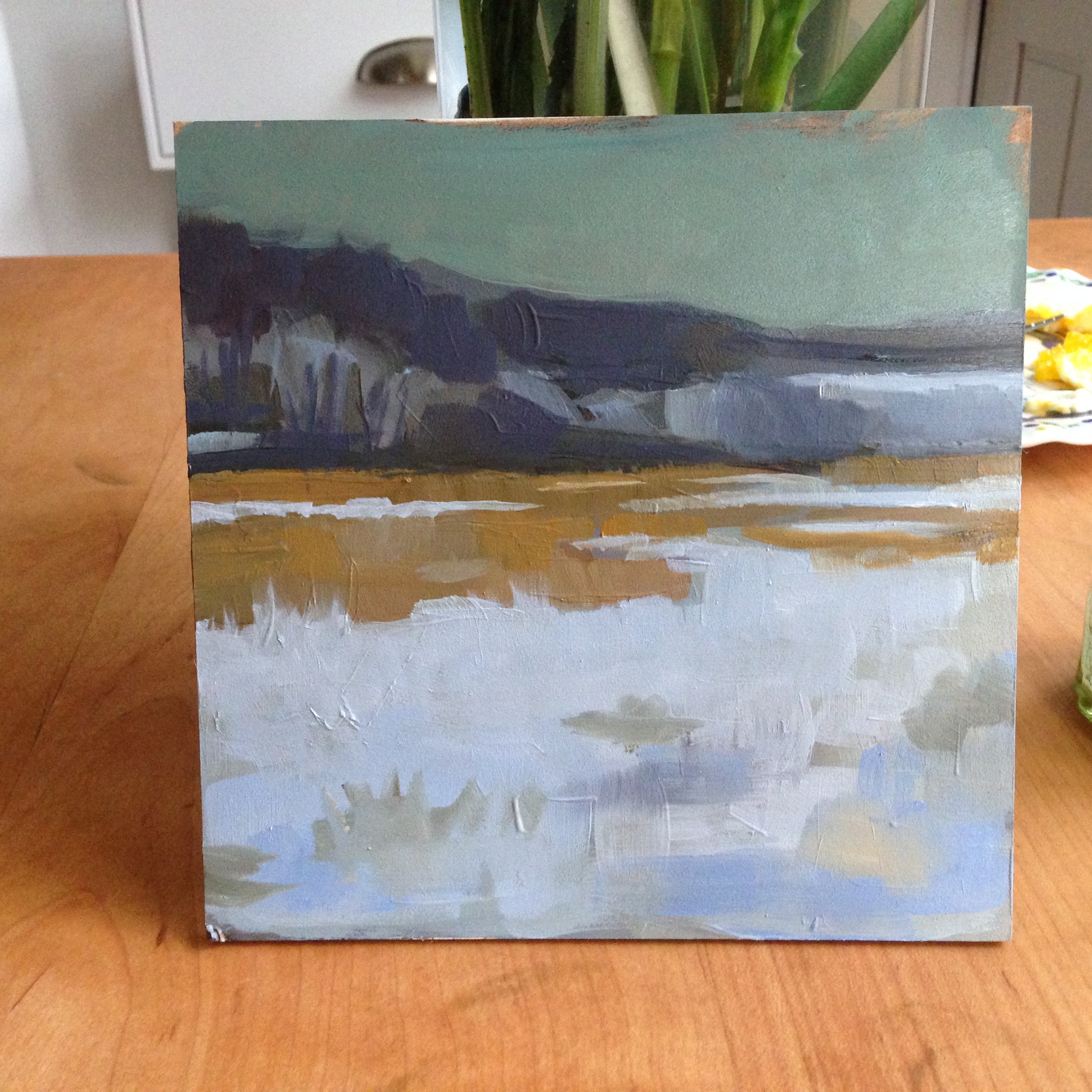
- For a light, spring green (grass, or light coming through leaves as in the painting shown) I use cerulean and cadmium yellow. This is the bright, acidic green. Adding white or a touch of red or ocher is often useful to knock the chroma down.
- For the dark greens in the shadows, I use ultramarine and cadmium yellow. Even though the ocher looks darker, the chalkiness of it will make a lighter green. Cadmium yellow gets a rich dark shadow green. I’ll add cadmium red medium to darken it even more.
- My favorite foreground or middle-ground ‘tree’ green is cerulean and ocher. It gets the perfect color of cypress or oak trees in sunlight. More ocher if it’s late afternoon or sunset.
- The last possible green is ocher and ultramarine, it gives a grey, chalky green which I almost never use for foreground or middle-ground greens. I’ll sometimes use it as a base color for olive trees. On the other hand it is very useful for distant tree-covered mountains.
The brand of paint is very important for getting the right colors.
- For cerulean blue, Old Holland makes the best one but it is outrageously expensive. For less important projects, Williamsburg or most other brands are just as good.
- Ultramarine Blue Deep by Old Holland is the only functional ultramarine I’ve found. It’s better than hand-ground ultramarines and is probably the one absolutely essential color on my palette.
- In my opinion, Williamsburg makes the best cadmium colors and their cadmium yellow light is perfect. Lately I’ve been using both their cadmium yellow light and cadmium yellow medium to vary my bright greens a bit.
- Zecchi’s Roman Ocher is the best yellow ocher I’ve used, though Old Holland’s golden ocher is a similar hue (if a bit stiff to work with, and slightly cooler).
Lately I’ve started using cobalt blue (any brand), but I don’t have any clever green mixes with it to speak of. I mostly use it for skies, shadows, or to mix a quick grey with cadmium orange."